


Announcement, Modern Marketing
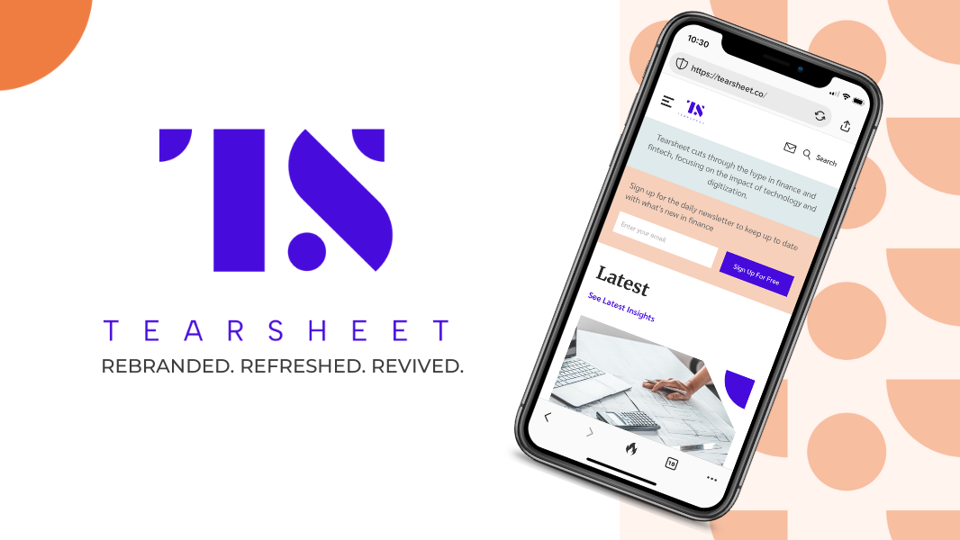
‘Hey, did you do something with your logo?’ Tearsheet’s brand – refreshed.
- We’ve got a new website, new colors, and a new logo — what gives?
- In this story, we’re diving into the ‘why’ behind Tearsheet’s makeover.