


“We’ve been inventing new possibilities in finance for over 12 years, it was time to reinvent ourselves”: Plaid’s Heads of Creative and Design break down the firm’s recent rebrand
- Plaid's growth has served as a catalyst for the firm's recent rebrand. The new look showcases their expanded capabilities, reach businesses beyond fintech, and forge stronger connections with both B2B and B2C customers.
- In their rebrand, Plaid maintained their recognizable logo but updated most visual touchpoints by incorporating elements inspired by paper money and historical figures like Benjamin Franklin and Abraham Lincoln.
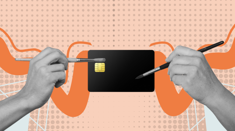
Plaid started out with a much narrower product suite and value proposition than they have today. The firm’s growth and maturity had made a brand update necessary – but rebrands are risky, difficult to execute, and easy to get wrong. But with a controlled scope, and a clear execution strategy rebrands can help brands reestablish their identities and drive even deeper brand recognition. With its recent rebrand this is what Plaid has aimed to achieve.
In today’s story we will discuss Plaid’s new look, the execution plan for its rebrand, and how it is measuring the success of its new efforts.
Setting goals
Plaid’s technological capabilities, products, and customers have changed dramatically over the years. With its recent rebrand, the firm wanted to signal how its products had grown from just being an account-linking solution to a “data network” according to Plaid’s Heather Mounsey, Head of Creative and Christope Tauziet, Head of Design, who also added further that the new brand needed to communicate Plaid’s work with all kinds businesses, not just fintechs.
Additionally, the brand also wanted to earn trust both up-market and with consumers. Its new identity needed to connect the firm with B2B and B2C customers.
The design remit
Design identities can go in many different directions. For example, Apple’s brand has always relied on minimalism, while brands like Klarna borrow heavily from maximalism by building bold, colorful, and edgy styles that lend a distinctive personality to the brand.
While the Plaid rebrand is extensive, it’s not an attempt to hollow out all of its assets and build anew. The firm’s rebranding efforts are more of a deep update of the brand’s visuals with a flourish of playfulness.
Here is how Plaid leverage paper money, a spectrum of colors and historical figures to build out its new look:
It’s all about color: Financial brands generally stay away from heavy use of color – most never go beyond blue. But the most recognizable brands in the financial industry today are standing out by using color more heavily in their brand identities.
Plaid’s new identity borrows heavily from the design techniques used in paper money and is reminiscent of a rainbow. Guilloche patterns — detailed engravings with curves and spirals – were first introduced to help reduce the printing of counterfeit money, and the new brand identity borrows from this history as well as the colors seen in the holographic strips in paper money.
Plaid’s new palette utilizes a broad range of colors with a soft but eye-catching green at its helm.
“Mint is our hero color in the palette. It symbolizes the blending of traditional finance (green) with technological opportunity (blue). The vibrancy of our palette signals innovation, while the spectrum itself is adaptable and ever-changing—just like our network and industry,” said Mounsey and Tauziet.
The colors in Plaid’s palette also have names like Piggy Bank for a vibrant pink and Gold Standard for a sun-like yellow. “Giving our colors names like Piggy Bank and Credit Lime are additional ways we sought to strengthen our ties to finance while showing our unique personality,” said Mounsey and Tauziet.