


Branding 101: How Klarna translates its branding principles into product and UX design
- Given mounting competition, one way a brand can build awareness among consumers is branding, and Klarna is one of the best.
- Dive into Klarna's branding principles and marketing campaigns to find out how the Swedish brand manages to stand out, marrying its design ideals to its products.

In the financial services industry where standing out is much harder due to the many competitors and the strict regulators, branding is in a double bind: it should be recognizable and responsible at the same time.
One of the best examples of pushing the envelope in this industry comes from Klarna. The Swedish brand’s website, app, products, and messaging all sing the same catchy harmony and it stays with you. This is how:
Find the right tone and voice: Klarna’s branding principles of “curiously bold”, “strikingly relevant” and “offbeat optimists” are strong examples of how branding can inform design, marketing and products.
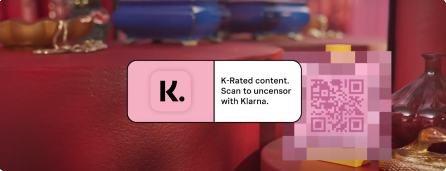
- Curiously Bold: Some time back the brand ran an interactive ad campaign called the “K-rated”. The ads had scannable pixelated images which curious customers would have to scan to get information of the product and access to deals. The whole campaign took inspiration from sex and porn and turned it into an interactive shopping experience. Klarna worked with the creative agency Thinkerbell on the campaign and Thinkerbell founder, Adam Ferrier told me that the idea was developed collaboratively by the two companies.
“Creating scarcity, or making something seem like it’s not easily available has the impact of people wanting to see it more. We used this psychological tool to make everyday objects seem ‘k-rated’, and could only be viewed via scanning the item via a QR code,” Ferrier said.
- Strikingly Relevant and Offbeat Optimists: Klarna’s target consumers are young and the way the brand uses eye-catching colors and photography reflects that. But the design goes deeper – its recent launch of Wikipink (which is a cool name for a well-designed and detailed About Us page) reflects the younger generation’s demand for transparency. Moreover, the firm’s partnerships with companies that have less of a carbon footprint, their Climate Fund, and prioritization of environmental friendly brands in the UX all reflect how branding informs and is informed by products.
Marry color and mechanics: Laurence Minsky, a consultant for brands like Amazon and Target and Joanna Holden, owner of branding and digital agency Modular, Ink both assert that Klarna’s pink allows the brand to stand apart from the barrage of blues, blacks, and whites out there. The fact that Klarna has used this color so strategically that they can name their About US page “Wikipink” is testament to how well the color has performed in setting them apart from competitors like Affirm, PayPal, and AfterPay.
The brand also uses their own play on the word “smooth” to communicate the ease of paying with Klarna. “Smoooth” as Klarna writes it is a simple change but emphasizes how they aren’t afraid of leveraging unconventional methods to communicate and emphasize. ”I would caution that wordplay like that for a financially related product without extra hints at their intentionality within the context (not in an external source like their advertising), as one could read it as a typo and, thus, sloppiness,” said Minsky.
While risky, this type of wordplay is right up Klarna’s alley, if its “K-rated” campaign is any indication. And this emphasis on “smoothness” also carries into their adverts. For example, one ad by Klarna shows a pencil easily glides into jelly. The textures in their photography to the rounded corners of every visual on their website encapsulate this approach.

One discrepancy that sticks out in Klarna’s design is that their merchant-facing website seems to be easier to navigate than their consumer side. The firm’s consumer-facing side takes a maximalist approach like that of “old school catalogs”, says Minsky, which can feel cluttered and is also in friction with Klarna’s self proclaimed “Swedish minimalism”.
Cut through the noise: Translating a range of actions and services into easily understood sections on a website and app can be hard. For example, Google and Amazon, both of which have complex sets of products and services, wrap their machinations into actionable items like Google’s search bar or Amazon’s checkout flow.
Here Minsky recommends hiding your complexities: “For example Rotary remains highly complex with its vast number of initiatives and programs. But the brand refresh simplified the experience into their three-item menu of “join leaders,” “exchange ideas,” and “take action,” making it easier for both members and non-members to get and stay involved.”