


Modern Marketing
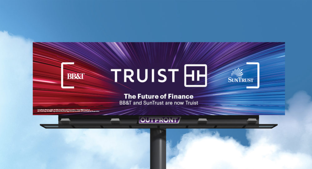
Truist launches new visual identity and logo
- The combined bank resulting from the SunTrust and BB&T merger unveiled a new look this week.
- It pays homage to both banks' heritages but reactions were split to the minimalist look.