

From safe blue to citrus green: How Wise rebranded to an identity that is exciting and good for its bottom line
- Rebrands are difficult but when done right they can deeply impact how firm's communicate their identities and value to their audiences as well as improve the bottom line by deepening recognition and connection with customers.
- Explore why Wise decided to rebrand, what the firm changed, and how it rallied its teams to reach the branding finish line.
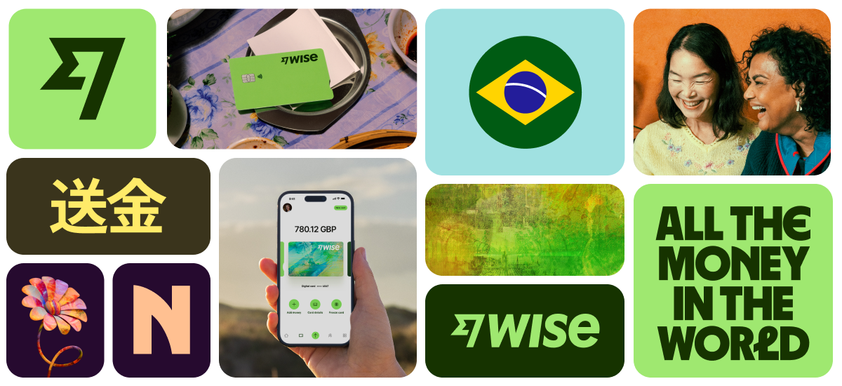
In 2023, Wise launched a rebrand that has the potential to make it into design school curricula. With its citrusy green, bold typography, and painterly approach to 3D visuals, the Wise brand today is unforgettable without being overwhelming.
In today’s story, we do a deep dive into the impetus behind this rebrand, its scope, how it was executed, and the results the brand has seen since the unveiling of the splashy new look last year.
Problem statement: Reflecting growth and maintaining recognition
The shedding of the word “Transfer” in Wise’s name came before the new look. The company was slowly building towards its new identity driven by its growth in terms of geographies it served, as well as the products it offered. Wise was no longer just about sending money – it had products that enabled customers to hold and spend money and it touched more people now than ever before.
The challenge, however, was making sure that the firm does not lose the trust customers had with the company and its brand recognition as it went through its metamorphosis, according to the firm’s CMO Cian Weeresinghe.

To ensure customers moved with the firm, the team at Wise decided to march as one. “This [maintaining brand recognition] was no easy feat, and required intense coordination and collaboration across multiple teams and channels including paid marketing, PR, CRM, brand systems, product discovery, organic social, and customer service,” said Ciam.
The Wise rebrand has been so successful because every part of the business feels like a vignette out of the same story.
The remit: A redesign with expanse and depth
Wise feels different since its rebrand. It feels alive and exciting. Chasing ephemeral feelings is difficult but if there is anything that can make you feel closer to a brand and view it with renewed excitement, it’s design.
And Wise’s new look was all encompassing. It’s hard to remember what Wise looked like before because the pieces today fit so well together. The same cannot be said for rebrands like that of Twitter, where the X and flat blacks only evoke nostalgia for better days.
Here is what Wise changed in the rebrand and how the firm thought about each piece:
a) Color Palette: The most noticeable change for Wise was perhaps the shift in its primary colors. The firm went from a safe blue to an energetic and electric green. “Wise doesn’t think of itself as a bank. It doesn’t act like a bank. The new green color represented a chance to make that stand again against what is a sea of sameness when it comes to other financial services brands,” said the firm’s VP of Brand Strategy, Iona Carter.
Carter also shared that the green helped with evocation by representing money and progress. Another important consideration for the wider color palette was accessibility. Testing and consumer feedback played an important role here in ensuring that the new look met both WCAG guidelines as well as APAC color standards.
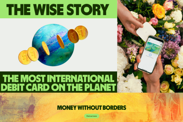
b) Visual Elements: Some of the best global brand identities and designs, like Apple, use 3D elements. Wise was one of the first brands to really own the 3D direction and is still one of the few brands in the financial services industry, particularly, to do so.
The Wise homepage today is dominated by a green-blue 3D globe that is orbited by currencies from various countries. The connection to Wise’s global nature and financial focus is clear from the outset. It was this globe that inspired the adoption of the 3D assets into other areas of the Wise website, says Carter.
The impetus for going in the 3D direction was the same as that for choosing green: Wise wanted to be distinctive and it wasn’t afraid to lean in. “2D illustrations are pretty rote at this point within brand identity systems,” said Carter.
3D design elements are more powerful than some may think. The gaming industry entered a new era when video games stopped being 2D and built immersive worlds by playing with light, environment, and movement. 3D visual elements give a sense of depth and realism, driving deeper engagement and connection.

For 3D illustrations texture is an important consideration, and Wise made what the firm calls “graphic tapestries” inspired by bank notes and visual elements from historical places, to come up with a painterly effect that gives these elements a rich, plush, and smooth feel.
“There’s enough thinking and theory now, at least in academic circles, around the importance of really distinctive assets for a brand,” said Carter.
c) Photography: Photographs help with feeling familiarity and grounding the design in the real world. For the rebrand, Wise wanted the photograph to emulate the dynamism that its other assets had.
“It’s challenging as a brand with a global reach to feel local, but also communicate globally. We felt photography was one element that we could really lean into that would enable us to do that,” said Carter.

The new photography came after careful art direction, and engenders a sense of movement, candid moments that represent real people, real emotions, and real moments from people’s lives.
The process: Keeping an eye on the ball and finding the right design partners
The Wise rebrand is successful not just because of what the firm accomplished, but also because of how it was done. From internal championing of the rebrand, deployment, to finding the right design company to work with, the processes of this rebrand are integral to the firm’s success with the project.
a) Deployment: Given that the digital touchpoints were now going to contain graphic-heavy assets, the team thought about how these designs will be implemented and deployed in customers’ experiences from day one, according to Carter.
“We were thinking about how what we built was going to be compatible with the Wise app, how it would work across desktop environments as well as how we could build a system that was ultimately simple but very scalable. We have a whole team now that just owns this remit called, ‘Brand Systems’,” said Carter.
She also shared that the firm has invested more heavily in building this team since the rebrand, with Brand Systems having grown considerably since the rebrand first rolled out.
b) Internal champions: With a wide ranging rebrand like this that impacts both high level things like color palette but also microinteractions, it’s important to keep reminding teams why they are doing what they are doing to act as a homing signal.
“Its an often overlooked job for any team that is spearheading a rebrand internally. [You need a] continual drum beat, that reminds people why we are doing this and contextualizing it,” Carter added.
c) Find the right partner: For the rebrand, Wise worked with Ragged Edge, a branding agency based in London, which has also worked with brands like Papier and Monzo. “We worked extremely closely with the Ragged Edge team, at every stage of the process, from ideation all the way through to how is this going to roll out in the product,” Carter shared.
Once the rebrand was done, Wise decided to continue its relationship with Ragged Edge, deciding that brand management, evolution, and design is a continuous process:
“The team intentionally opted to keep them in a retainer capacity. Because, the work of a rebrand, and in some ways, is never done. We’ve continued to work with them, albeit on a lower drum beat.”
The results are in
Not all rebrands reinvigorate excitement about the firm. Twitter’s rebrand to X actually led to its downloads dropping, as well as a 4% drop in active users. This is despite the fact that the firm was now attached to the most famous tech personality in the world, Elon Musk.
For Wise, however, the numbers tell a positive story. For the financial year of 2024, 48% of personal customers and 60% of business customers are using more than one Wise product in comparison to 36% and 55% respectively in 2023, according to the firm’s CMO Weeresinghe.
The firm’s overall growth also reflects the success of the rebrand, with the firm experiencing a 34% YOY growth in the first year (2022-2023) after the new identity’s launch and another 29% growth to 12.8 million active customers by the end of the financial year 2024.
Sidebar: Branding makes perfect
Branding can be a powerful tool for communicating a firm’s core message, values, ethos, and personality to customers. And the more creatively a firm things about using assets and channels, the better.
Last year we looked at how Klarna uses a unique tone, imagery, and marketing campaigns to reach and engage its audience and stand out in the payments and shopping space.
Some time back the brand ran an interactive ad campaign called the “K-rated”. The ads had scannable pixelated images which curious customers would have to scan to get information of the product and access to deals. The whole campaign took inspiration from sex and porn and turned it into an interactive shopping experience. Klarna worked with the creative agency Thinkerbell on the campaign and Thinkerbell founder, Adam Ferrier told me that the idea was developed collaboratively by the two companies.
“Creating scarcity, or making something seem like it’s not easily available has the impact of people wanting to see it more. We used this psychological tool to make everyday objects seem ‘k-rated’, and could only be viewed via scanning the item via a QR code,” Ferrier said.
Another modality for brand and design heads to consider is sound. Think of sonic branding as a brand’s auditory handshake – it’s what ties the object (brand) to its attributes (convenient, trustworthy, etc.) in consumers’ minds.
“Sonic branding can be leveraged to build recall and association between brands and their campaigns and special products/services. Specifically in the financial services sector, sound branding can provide levels of assurance to the consumer surrounding the exchange of money or services,” said Austin Coates, Research & Insights Consultant at amp, a sonic branding agency.