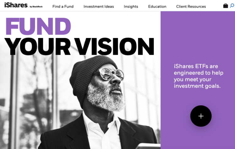
Behind the bold new iShares rebrand
- Leading ETF brand iShares has introduced a new image, colors, and font.
- It's all part of being seen as more accessible to clients and more closely share BlackRock's image and messaging.

iShares has unveiled a new, bold visual identity. The rebranding allows for simple, impactful storytelling across all client segments, product portfolios and the markets iShares operates in globally. As the company has grown and matured, it increasingly projects more of a lifestyle and educational brand than the more technical and specifications-focus of its earlier days.
The company’s new logo positions it closer to corporate owner, BlackRock. Both firms' logos now use the same large readable typography and their visual identities share a few colors, typography and grid system. The iShares logo incorporates its new font, BLK Fort Book, as the tone of voice will shift towards clear, action-oriented language that appeals to investors of all levels of experience and knowledge.
Many financial services brands have a similar, traditional look-and-feel and tonality. Tearsheet talked with Alex Craddock, iShares’ Managing Director and Global CMO about his feeling that this new work gives iShares "a ‘category-busting’ visual identity, bringing its purpose and mission to life, establishing iShares as an accessible partner committed to investor progress".
What prompted the rebranding?
“The ETF industry is at an inflection point towards massive growth over the next four years—iShares forecasts that the ETF industry’s AUM will grow to $12 trillion by 2023, about double what it is today.
This growth is bringing new competitors and, in turn, more products and more choice to clients. In a more complex landscape, investors turn to strong brands to help them navigate this choice and find the products that meet their needs.
As a market leader, with over 800 funds globally and exposure to virtually every market, our clients and partners work with us because we can help them achieve their goals. They believe in our business and what our brand stands for. This brand refresh is a way for iShares to continue to build upon and accurately reflect those expectations.”
Why did you choose evocative colors?
“We wanted our color palette to reflect who iShares is and our ambition, while standing out against the “sea of sameness” in the financial services category. Our color palette emphasizes our accessibility and approachability as a partner for investor progress.”
Why did you decide to incorporate BlackRock components in the logo?
“iShares is BlackRock’s ETF brand. We wanted a clear and strong connection to BlackRock as iShares advances the BlackRock brand purpose of ‘helping more and more people experience financial wellbeing’ through ETFs and Indexing. Also, iShares along with BlackRock’s investment expertise and alpha seeking and factor products ensures we are able to better serve our clients’ needs. Acknowledging the relationship through the visual identity will remind investors that with iShares, they always have access to the very best tools to progress towards their goals.”
Did you use an agency? How and why did you choose this agency?
“Yes, the refreshed visual identity was developed in partnership with Turner Duckworth. We chose Turner Duckworth because they are a best-in-class, global design agency that has immense experience transforming global brands through design and visual identity.”
What do you have planned to get the word about the new image out?
“Our reimagined brand will be experienced across a variety of channels. You will see our brand come to life through iShares.com, all of our interactions with clients, events and tradeshows, a global campaign and more throughout 2019. Our global campaign will be supported through disruptive channels with a focus on unique content based storytelling opportunities. It will launch in the United States and Latin American in Q2, then rolling out through APAC and EMEA later in 2019.”