The Quarterly Review: Newline by Fifth Third’s GM Tom Bianco plans on strengthening products, client experiences, and brand equity


Notes from the desk: Welcome to this month’s Quarterly Review, a series where I dive into what executives from some of the best brands in financial services are focusing on in this quarter, as well as how they are planning to achieve their goals. It’s a chance for the industry to learn about what goes on behind an FI’s four walls and how leadership manages their priorities. 

But that’s not all: a review implies no mandates, a check in. So stay tuned next quarter to learn whether the executive achieves his plans and translates theory into reality.


In this edition, we will focus on Tom Bianco, General Manager at Newline by Fifth Third. 

Bianco runs Newline by Fifth Third, and has previous experience at J.P. Morgan Chase as Executive Director and Vice President of Payments Strategy. In the following quarters, Bianco’s plans span product development, improvement of client relationships, as well as creating a stronger image and recognition for the Newline by Fifth Third brand.

The focus: Products, client experiences, and brand awareness

Bianco: Our focus for the coming quarters is going to center around three main pillars:
 

  • Build brand awareness and recognition for Newline in the broader fintech ecosystem.
  • Continue delivering new and innovative solutions for our clients to build their end user value propositions. 
  • Drive richer program manager experiences to unlock operating efficiencies.

1. Build new products and services for our clients:

We will see a lot of value propositions around account to account payments, leveraging what’s going on in Open Banking in the United States. We have an Open Banking groundswell of activity, plus real time payments like FedNow, which is a software-based payment method – those two things come together, and we see a total open market and opportunity for us to help our customers and our clients build their value propositions and take advantage of those two changes in the payments ecosystem in the US.

With real time payments and FedNow, we have two payment networks that are built for real time and have started to look more like card networks, as opposed to ACH. We have payment methodologies and technologies that can keep pace with the real time world, which is not historically how the banking and payment sector outside of the card networks have operated in the US. So we think those two things are going to create a massive opportunity in the US. 

  1. Drive richer program manager experiences

Often we get stuck in calling and emailing. But if you are building digital first payment experiences, you need a digital first relationship experience on the banking side for our program managers or our clients so they can leverage the power of software and the power of integration to support their business. 

We need to even out the relationship experience with the digital experience so that our clients and our solutions. 

  1. Build better brand awareness and recognition

We need to just make sure everybody understands that Newline is a Fifth Third brand. We have Newline by Fifth Third because we have a separate client set that we’re going after. So we need to make sure that there’s brand uniqueness, but we can’t lose the identity of the strength, stability, and the power of one of the largest banks in the United States. 

First, we need to make sure everybody understands Newline is a part of Fifth Third. Secondly,  we need to make sure people understand that even though we are a part of Fifth Third, we can move at the pace that they expect a fintech to move at. That’s been one of the proudest moments we’ve had at Newline. 

If you look at our clientele, we’re able to keep pace with them on product delivery, product development, and innovation. That’s one of those messages we want to get out to the market.  

Plan of action

  1. Strategy for product innovation and delivery

The way we’ve built and deployed the Newline solutions is that we like to have a single API endpoint for all payments, information, and accounts. Hence, we’ll continue to add functionality to those endpoints, and it’ll be one integration, and then you’ll have all the payment capabilities that exist through the Newline platform. 

Our goal is to make sure that everything that is necessary is available on the Newline platform, and then build the easiest implementation and integration experience for our clients. We try to remove a lot of complexity, so you don’t have to be an expert level software engineer to figure out how to get the integration done. 

  1. Blueprint for improving program management and client experience

We need to have the right tools and technologies to allow the relationship and the partnerships team to really figure out what is that next thing that we’re doing together with our clients. Allow the technology and the automation to exist, and the day-to-day operational experiences to be as streamlined and as efficient as the end user value proposition that we’re helping build with our clients. We are looking to empower the people to do the creative, strategic work, and letting the software handle some of the day-to-day.

To help with this, we do a lot of voice of customer exercises, to understand where some of those improvements can be delivered in the life cycle. We spend a lot of time meeting with our clients to understand the things that they’re trying to do and what information they need to get it done. We also ask how we can give them the information in the way they need and where can we automate certain process steps? So we spend a lot of time with our clients, just understanding what their expectations are, and then how we can drive a better experience on either side of the coin.

  1. Plans for creating more awareness and recognition for Newline by Fifth Third

We will bring more of our software engineering leadership into industry events with us. One of the things that makes Newline unique is that we have our own dedicated revenue organization, run by Dan Dall’Asta who leads the distribution channel for us, which includes traditional bank relationship managers. We have our own product organization led by John Piazza. Christopher Tino runs our software engineering organization. 

So within Newline, we have a dedicated group of professionals, and this is all we do all day long. We’re not bringing in a lead and then handing it off to a different product team or a different technology team. It’s all self-contained within Newline, the client targeting, relationship, onboarding, product development, servicing, support and implementation. 


Last month we covered


“We’ve been inventing new possibilities in finance for over 12 years, it was time to reinvent ourselves”: Plaid’s Heads of Creative and Design break down the firm’s recent rebrand

Plaid started out with a much narrower product suite and value proposition than they have today. The firm’s growth and maturity had made a brand update necessary – but rebrands are risky, difficult to execute, and easy to get wrong. But with a controlled scope, and a clear execution strategy rebrands can help brands reestablish their identities and drive even deeper brand recognition. With its recent rebrand this is what Plaid has aimed to achieve. 

In today’s story we will discuss Plaid’s new look, the execution plan for its rebrand, and how it is measuring the success of its new efforts. 

Setting goals

Plaid’s technological capabilities, products, and customers have changed dramatically over the years. With its recent rebrand, the firm wanted to signal how its products had grown from just being an account-linking solution to a “data network” according to Plaid’s Heather Mounsey, Head of Creative and Christope Tauziet, Head of Design, who also added further that the new brand needed to communicate Plaid’s work with all kinds businesses, not just fintechs.

Additionally, the brand also wanted to earn trust both up-market and with consumers. Its new identity needed to connect the firm with B2B and B2C customers. 

The design remit

Design identities can go in many different directions. For example, Apple’s brand has always relied on minimalism, while brands like Klarna borrow heavily from maximalism by building bold, colorful, and edgy styles that lend a distinctive personality to the brand.

While the Plaid rebrand is extensive, it’s not an attempt to hollow out all of its assets and build anew. The firm’s rebranding efforts are more of a deep update of the brand’s visuals with a flourish of playfulness. 

Here is how Plaid leverage paper money, a spectrum of colors and historical figures to build out its new look: 

It’s all about color: Financial brands generally stay away from heavy use of color – most never go beyond blue. But the most recognizable brands in the financial industry today are standing out by using color more heavily in their brand identities.  

Plaid’s new identity borrows heavily from the design techniques used in paper money and is reminiscent of a rainbow. Guilloche patterns — detailed engravings with curves and spirals – were first introduced to help reduce the printing of counterfeit money, and the new brand identity borrows from this history as well as the colors seen in the holographic strips in paper money.

Plaid’s new palette utilizes a broad range of colors with a soft but eye-catching green at its helm.

“Mint is our hero color in the palette. It symbolizes the blending of traditional finance (green) with technological opportunity (blue). The vibrancy of our palette signals innovation, while the spectrum itself is adaptable and ever-changing—just like our network and industry,” said Mounsey and Tauziet. 

The colors in Plaid’s palette also have names like Piggy Bank for a vibrant pink and Gold Standard for a sun-like yellow. “Giving our colors names like Piggy Bank and Credit Lime are additional ways we sought to strengthen our ties to finance while showing our unique personality,” said Mounsey and Tauziet. 

Drawing (upon) the greats: Perhaps the most engaging and new part of the rebrand are the illustrations of Benjamin Franklin and Abraham Lincoln. Both personalities feature heavily in paper money, but Plaid has put a fun twist to these personalities, portraying Franklin holding a peace sign and a smart phone, and Lincoln smirking at a laptop while nursing an energy drink. 

Made by hand and wood cut, these illustrations are an excellent example of how art can bridge two time periods and tell a story of movement and progress, while also anchoring consumers in values like legacy and trust. It’s these kinds of flourishes that really set fintech brands apart from traditional financial institutions.


What didn’t change: One important decision of the Plaid rebrand concerns the firm’s logo. While the firm made changes to most visual touchpoints, the logo stayed the same. 

Plaid’s logo is an important part of its genesis story because the first algorithms its founders created roughly resembled a plaid pattern when drawn out on a whiteboard. 

“With 1 in 2 banked Americans having used Plaid, the most recognizable aspect of our brand today is our logo. The trust and security that symbol represents was something we decided to preserve and take with us into the future. Now, we’re placing even more equity in the symbol itself, which still resonates deeply with loyal customers, users, and institutions across the Plaid Network,” said Mounsey and Tauziet. 

The execution

A firm can build the best design assets, but it’s the implementation stage that can make or break the rebranding process and efforts. 

Having a close collaboration process with Plaid’s leaders, as well as carefully planning out the rebrand roll out stage contributed to making the execution stage successful:

Getting executive buy-in: “The strength of our new brand comes from its foundation in strategy and our close partnership with our CEO, Zach Perret, and President, Jen Taylor, through every step of its creation. They weren’t stakeholders to be presented to; they were part of the core project team, collaborating closely with our internal brand and product design teams on a weekly basis,” said Mounsey and Tauziet.  

Technological lift : Plaid started working on its rebrand in Q1 of 2024. The turnaround time is relatively short for such an extensive change, especially given the many customers, businesses, financial institutions that the firm touches. 

“While finalizing the brand system’s core assets, we also performed extensive content audits of our digital and physical collateral to gauge the lift required to “flip” our brand surfaces and made prioritized plans for creation and dedicating the necessary internal resources to make launch a success on an accelerated timeline,” said Mounsey and Tauziet, adding further that teams across all time zones were made to prioritize the rebranding efforts with the executives, diverting resources when necessary. 

The team also expects to put this design to work in the real world, featuring it in the firm’s tradeshow appearances and in Plaid’s annual customer conference, Effects. 

Measuring success

To ensure that the rebrand achieves its goals, the firm is monitoring marketing-related KPIs across its digital footprint and campaigns. But the firm also plans on tracking employer brand metrics like applicant volumes and employee engagement data points, as well as “qualitative and qualitative data from our in-person experiences, selling journey, and direct customer feedback. And of course, we’ll be performing regular brand health studies to keep the pulse on brand perception shifts and brand awareness lift,” said Mounsey and Tauziet. 


Sidebar: Wise’s bold rebrand

Sidebar is a member-exclusive section, if you want to keep reading please consider becoming a TS Pro member by clicking below. 

TS Pro subscription options

The Quarterly Review: Chase’s Chief Design Officer Miki Van Cleave is digging into discovery and building better experiences


Notes from the desk: Welcome to this month’s Quarterly Review, a series where I dive into what executives from some of the best brands in financial services are focusing on in this quarter, as well as how they are planning to achieve their goals. It’s a chance for the industry to learn about what goes on behind an FI’s four walls and how leadership manages their priorities. 

But that’s not all: a review implies no mandates, a check in. So stay tuned next quarter to learn whether the executive achieves her plans and translates theory into reality.


In this edition we will
focus on Miki Van Cleave,
Chief Design Officer
at Chase.

The bigger an organization, the harder it is to ensure that customer and employee experiences speak the same language. One of Chase’s Chief Design Officer Miki Van Cleave’s key objectives is to ensure there is harmony between the firm’s customer and employee experiences. 

Van Cleave assumed the role seven months ago after spending five years as Head of Design for the firm’s CI&A (Customer Identity & Authentication) and Consumer Banking, where she built multiple design teams and worked on creating interconnected experiences.

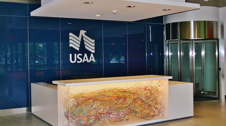
Before Chase, Miki held several leadership roles at USAA Federal Savings Bank. She ran the bank’s innovation team and designed its auto experience product. 

Today she is here to share how she is strategizing for growth in her new role by breaking silos, digging into Chase’s backend processes, and building more confidence in product delivery and design processes of the firm.

The focus: Growth, codifying discovery processes, and improving employee experiences

I stepped into the role of Chief Design Officer in August 2024, and since then my goal has been to learn as much as I can and hit the ground running, picking up where my predecessor left off. The team achieved so much in 2024, and my goal is to keep up the team’s awesome momentum in delivering great experiences and products to our customers in Q1 2025 and beyond. Some of the key achievements in 2024 include increasing our investment in our teams in India, which has been a multi-year focus, and gaining clarity on our body of work (BOW) and improved team allocations to enable us to work more efficiently. 

Something I am really proud of is that we started a Challenge Coin recognition program in Design & Customer Experience. Inspired by military coins, I hand out Challenge Coins in person to those employees who have been nominated as showing up and willing to help.

1. Enhancing employee experiences: Customer-centric design continues to be at the forefront of our design strategy and we’re constantly working on new ways to enhance experiences for our customers and employees. Employees in our branches and answering our customers’ calls are the lifeblood of Chase, and it’s crucial we equip them with the right tools and resources to do their jobs. The team is so good at their craft, they know the space and know how to deliver great products. The next level of maturity for us will be to raise our business acumen and continue elevating our presence and profile within the design, product, tech, and data teams and business partners.

2. Building up: We’re currently focused on continuing our overall growth, building on what we accomplished in 2024. This includes ongoing conversations to align on a detailed BOW (Body of Work) and broader awareness across the organization’s leadership on driving efficiencies as we grow and evolve the team.

3. Discovery processes: I also want to codify our approach to discovery, which will help to raise our confidence on new product delivery and get alignment with our partners on the ROI of design. We’ve seen success in formalizing other processes and problem-solving approaches, like our “Customer Why Template,” and know there is value in continuing to standardize processes for better collaboration.

Plan of action

It’s important for us to stay focused on our objectives, while continuing to cultivate new ideas.

The key is to avoid being distracted in a fast-moving environment and stay the course.

1.  Working beyond silos: It’s critical that we look beyond our own team to solve problems and come up with new ideas. We want to avoid silos and collaborate with other teams to help us understand and better solve a customer issue. A design challenge isn’t always going to be solved by the design team alone; sometimes we need to enlist the support and ideas of people from product, data and other teams from our Product and Experience and Technology (PXT) organization, as well as customer-facing businesses from Chase’s consumer bank, to help us find the right solution.

2. Understanding the whole experience: Beyond designing new features that help solve a customer pain point, we also want to ensure we’re providing the best overall multichannel experience. This means looking at the customer experience holistically — not just at visible experiences like the mobile app, web or branch — to ensure there are no gaps. We employ Service Design Blueprints to understand how less-visible factors, like how back-end systems, call center policies and scripts, and more may be impacting the customer experience.

We’ve seen success in formalizing other processes and problem-solving approaches, like our “Customer Why Template,” which was an early tool in our discovery processes. We are now creating a more standardized practice for discovery which will help create consistency across the organization. Some of the key objectives are:

  1. Create a common understanding around what discovery means
  2. Establish timelines for how long discovery should take to complete
  3. Increase confidence in a design/product solution on the path to execution
  4. Mitigate risk 


Last month we covered


From safe blue to citrus green: How Wise rebranded to an identity that is exciting and good for its bottom line

In 2023, Wise launched a rebrand that has the potential to make it into design school curricula. With its citrusy green, bold typography, and painterly approach to 3D visuals, the Wise brand today is unforgettable without being overwhelming.

In today’s story, we do a deep dive into the impetus behind this rebrand, its scope, how it was executed, and the results the brand has seen since the unveiling of the splashy new look last year.

Problem statement: Reflecting growth and maintaining recognition

The shedding of the word “Transfer” in Wise’s name came before the new look. The company was slowly building towards its new identity driven by its growth in terms of geographies it served, as well as the products it offered. Wise was no longer just about sending money – it had products that enabled customers to hold and spend money and it touched more people now than ever before.

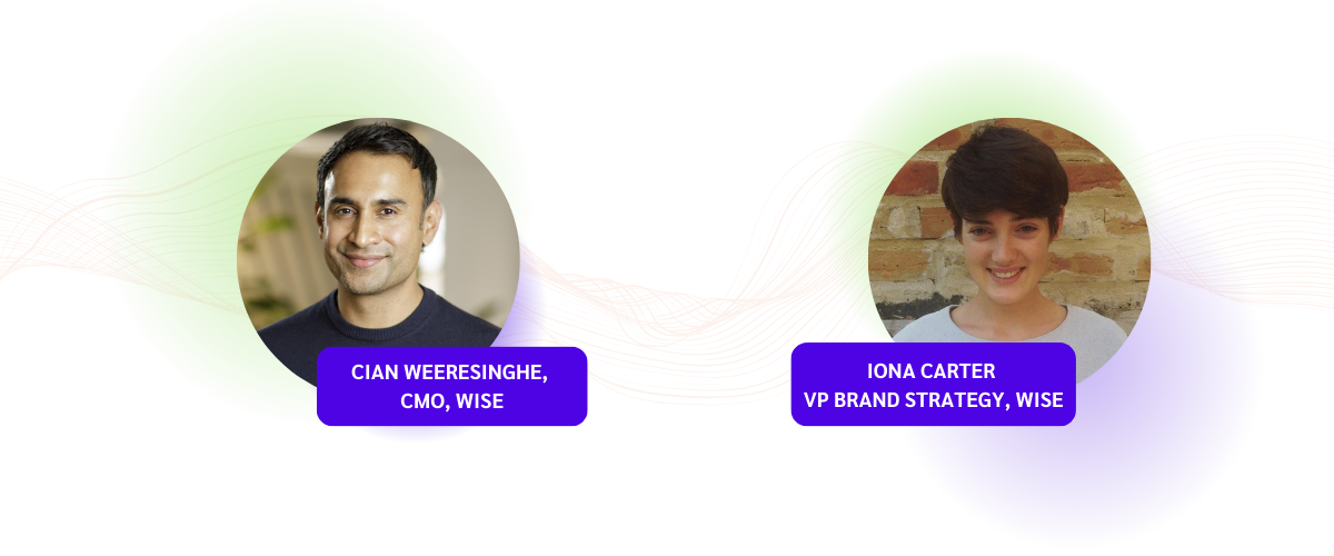
The challenge, however, was making sure that the firm does not lose the trust customers had with the company and its brand recognition as it went through its metamorphosis, according to the firm’s CMO Cian Weeresinghe. 

To ensure customers moved with the firm, the team at Wise decided to march as one. “This [maintaining brand recognition] was no easy feat, and required intense coordination and collaboration across multiple teams and channels including paid marketing, PR, CRM, brand systems, product discovery, organic social, and customer service,” said Ciam. 

The Wise rebrand has been so successful because every part of the business feels like a vignette out of the same story. 

The remit: A redesign with expanse and depth

Wise feels different since its rebrand. It feels alive and exciting. Chasing ephemeral feelings is difficult but if there is anything that can make you feel closer to a brand and view it with renewed excitement, it’s design. 

And Wise’s new look was all encompassing. It’s hard to remember what Wise looked like before because the pieces today fit so well together. The same cannot be said for rebrands like that of Twitter, where the X and flat blacks only evoke nostalgia for better days. 

Source: Wise

Here is what Wise changed in the rebrand and how the firm thought about each piece:

a) Color Palette: The most noticeable change for Wise was perhaps the shift in its primary colors. The firm went from a safe blue to an energetic and electric green. “Wise doesn’t think of itself as a bank. It doesn’t act like a bank. The new green color represented a chance to make that stand again against what is a sea of sameness when it comes to other financial services brands,” said the firm’s VP of Brand Strategy, Iona Carter.

Carter also shared that the green helped with evocation by representing money and progress. Another important consideration for the wider color palette was accessibility. Testing and consumer feedback played an important role here in ensuring that the new look met both WCAG guidelines as well as APAC color standards.

b) Visual Elements: Some of the best global brand identities and designs, like Apple, use 3D elements. Wise was one of the first brands to really own the 3D direction and is still one of the few brands in the financial services industry, particularly, to do so. 

The Wise homepage today is dominated by a green-blue 3D globe that is orbited by currencies from various countries. The connection to Wise’s global nature and financial focus is clear from the outset. It was this globe that inspired the adoption of the 3D assets into other areas of the Wise website, says Carter. 

The impetus for going in the 3D direction was the same as that for choosing green: Wise wanted to be distinctive and it wasn’t afraid to lean in. “2D illustrations are pretty rote at this point within brand identity systems,” said Carter.

3D design elements are more powerful than some may think. The gaming industry entered a new era when video games stopped being 2D and built immersive worlds by playing with light, environment, and movement. 3D visual elements give a sense of depth and realism, driving deeper engagement and connection.

For 3D illustrations texture is an important consideration, and Wise made what the firm calls “graphic tapestries” inspired by bank notes and visual elements from historical places, to come up with a painterly effect that gives these elements a rich, plush, and smooth feel.

“There’s enough thinking and theory now, at least in academic circles, around the importance of really distinctive assets for a brand,” said Carter. 

c) Photography: Photographs help with feeling familiarity and grounding the design in the real world. For the rebrand, Wise wanted the photograph to emulate the dynamism that its other assets had.

“It’s challenging as a brand with a global reach to feel local, but also communicate globally. We felt photography was one element that we could really lean into that would enable us to do that,” said Carter.

The new photography came after careful art direction, and engenders a sense of movement, candid moments that represent real people, real emotions, and real moments from people’s lives.

The process: Keeping an eye on the ball and finding the right design partners

The Wise rebrand is successful not just because of what the firm accomplished, but also because of how it was done. From internal championing of the rebrand, deployment, to finding the right design company to work with, the processes of this rebrand are integral to the firm’s success with the project.

a) Deployment: Given that the digital touchpoints were now going to contain graphic-heavy assets, the team thought about how these designs will be implemented and deployed in customers’ experiences from day one, according to Carter.  

“We were thinking about how what we built was going to be compatible with the Wise app, how it would work across desktop environments as well as how we could build a system that was ultimately simple but very scalable. We have a whole team now that just owns this remit called, ‘Brand Systems’,” said Carter. 

She also shared that the firm has invested more heavily in building this team since the rebrand, with Brand Systems having grown considerably since the rebrand first rolled out. 

b) Internal champions: With a wide ranging rebrand like this that impacts both high level things like color palette but also microinteractions, it’s important to keep reminding teams why they are doing what they are doing to act as a homing signal.

“Its an often overlooked job for any team that is spearheading a rebrand internally. [You need a] continual drum beat, that reminds people why we are doing this and contextualizing it,” Carter added. 

c) Find the right partner: For the rebrand, Wise worked with Ragged Edge, a branding agency based in London, which has also worked with brands like Papier and Monzo. “We worked extremely closely with the Ragged Edge team, at every stage of the process, from ideation all the way through to how is this going to roll out in the product,” Carter shared. 

Once the rebrand was done, Wise decided to continue its relationship with Ragged Edge, deciding that brand management, evolution, and design is a continuous process: 

“The team intentionally opted to keep them in a retainer capacity. Because, the work of a rebrand, and in some ways, is never done. We’ve continued to work with them, albeit on a lower drum beat.”

The results are in

Not all rebrands reinvigorate excitement about the firm. Twitter’s rebrand to X actually led to its downloads dropping, as well as a 4% drop in active users. This is despite the fact that the firm was now attached to the most famous tech personality in the world, Elon Musk. 

For Wise, however, the numbers tell a positive story. For the financial year of 2024, 48% of personal customers and 60% of business customers are using more than one Wise product in comparison to 36% and 55% respectively in 2023, according to the firm’s CMO Weeresinghe.

The firm’s overall growth also reflects the success of the rebrand, with the firm experiencing a 34% YOY growth in the first year (2022-2023) after the new identity’s launch and another 29% growth to 12.8 million active customers by the end of the financial year 2024.

The above graphic is created by Tearsheet using assets from the Wise website.

Sidebar: Branding makes perfect

Branding can be a powerful tool for communicating a firm’s core message, values, ethos, and personality to customers. And the more creatively a firm things about using assets and channels, the better. 

Last year we looked at how Klarna uses a unique tone, imagery, and marketing campaigns to reach and engage its audience and stand out in the payments and shopping space. 
 
Some time back the brand ran an interactive ad campaign called the “K-rated”. The ads had scannable pixelated images which curious customers would have to scan to get information of the product and access to deals. The whole campaign took inspiration from sex and porn and turned it into an interactive shopping experience. Klarna worked with the creative agency Thinkerbell on the campaign and Thinkerbell founder, Adam Ferrier told me that the idea was developed collaboratively by the two companies.

“Creating scarcity, or making something seem like it’s not easily available has the impact of people wanting to see it more. We used this psychological tool to make everyday objects seem ‘k-rated’, and could only be viewed via scanning the item via a QR code,” Ferrier said.  

Another modality for brand and design heads to consider is sound.  Think of sonic branding as a brand’s auditory handshake – it’s what ties the object (brand) to its attributes (convenient, trustworthy, etc.) in consumers’ minds.

“Sonic branding can be leveraged to build recall and association between brands and their campaigns and special products/services. Specifically in the financial services sector, sound branding can provide levels of assurance to the consumer surrounding the exchange of money or services,” said Austin Coates, Research & Insights Consultant at amp, a sonic branding agency.